If you read the previous update post, then you may have gathered that I’m pivoting directions with the project. Away from the archaic and at-the-mercy-of-slow-web-hosts website model, to something more contained and more conducive to telling a good story and stretching my artistic and creative muscles.
That post was insanely long, so I’ll be doing my best to keep this short. In that post, I not only poured my heart out at all of the frustration I’ve been feeling with this project recently but also detailed a lot of parts of the site that I’d deleted.
Here, the list of deleted items continues in more detail since the last update. Alongside some new additions so that the site serves a newer, greater purpose with the new direction. Hopefully, it’ll be a more pleasant experience now that it’s been more slimmed down.
Items Deleted:
- The whole entire Suggestion Box and everything that goes along with it! I know, shocking! But honestly, a better way to reach me would be either on social media or through discord. I never check my emails anyway. Didn’t get a screenshot of the page before I did that, but that’s ok, the illustration was old anyway. You can find it in the gallery if you’d like. But I have half a mind to delete the gallery as well, as it’s also not really needed anymore. I’m keeping it for nostalgia purposes. I’m still combing other pages and removing links to it and finding new ones as I write this.
- I’m also seriously debating deleting the library with all of the flippy books that I showed off in a previous library update. I can keep it alongside some of the javascript entertainment spectacles like the Babbling Brooke quote generator, the interactive maps, and the runes you can cast to get an online reading. But it all takes up space and I’m all about trimming the fat at the moment. I may regret deleting this in the future, however, so I’ve made private all of these pages for now.
- The email sign-up link has been removed as well as the pop-up with the squirrel on it. I don’t actually have an email marketing campaign, nor do I want to run one. As stated before, I barely check my own emails, and would very much prefer to not be the cause of spam anguish in the inboxes of others. This may change in the future, but for right now, I don’t want to spread myself too thin.
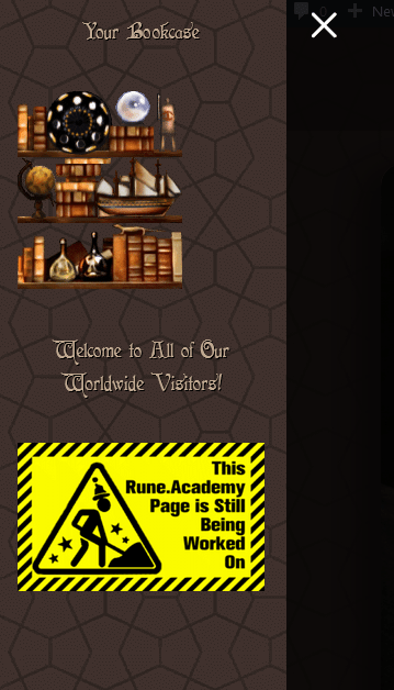
- The side menu with the bookcases and other little widgets, as well as the side column on the Updates page

They were useful when there were lots of links to click such as “Join the Community”, “Login”, “Your Courses”, “View Your Profile”, etc. I even illustrated each bookshelf to make sense for the links it would hold. For example, the one with the globe was the one that housed the maps. And at one point, they seemed like the most important thing in the world to get right, as this would be the main panel used to navigate for everyone visiting. But now, absolutely useless. I removed all of those unimportant items and moved the visitor widget to the footer. Here are screenshots of them right before deletion.
I’m entirely unsure if I could use them for anything in the future with the new iteration of the project. They’ll likely be flying around in scrap limbo for a while.

- Removed a fairly dumb widget about safety and security that was just taking up space for no good reason and replaced it with the visitors’ map in the footer (as mentioned above).
- I reworked the entire About Us page (I’ll go into it more below). But in doing so, I removed quite a lot of text. Again, I’m all about trimming the fat right now and I’m absolutely not in the mood for flowery language. Alongside this, I removed the volunteer profile area where I had everyone’s photos and blurbs. For one thing, there are quite a bit more names that must be added now, and adding a photo and description for everyone would take too much time. But most importantly, not everyone wants to have their photos and information shared so nonchalantly. A concern regarding reverse image search has also been brought up and all images have been removed. In my mind, the ultimate success of the project is still up in the air, and I don’t want to lead anyone astray by talking it up like it’s the best thing since sliced bread. It’s simply a creative project that I’m slowly working on snowballing and I sincerely appreciate every time anyone wants to help out of the kindness of their heart. The need and requests for privacy are completely understandable to me and I absolutely respect the boundaries set by others. I didn’t touch the “In Loving Memory” portion though. It’s a very important section to me – but if family members of the individuals reach out to take them down, I will.
- I removed testimonials from both the Front Page as well as the About Us section and moved them to the currently under construction runeshops.com website I’ve finally started working on. Again, I want to compartmentalize, organize, and trim the fat in as many places as possible, and those testimonials no longer make sense being in those areas.
Items Added:
- The Roadmaps Hub containing these three roadmaps so far:
- Rune Academy Virtual Project Creation Cumulative Credits were added to the About Us page in place of the prior volunteer blurbs.
Items Tweaked:
- Edited some of the look-and-feel and text on the homepage to echo the new direction of the site/project.
- Fixed some broken elements on the calendar page that changed due to updates and me getting a bit too happy deleting things.
- Updated all text on the About Us page to fit with the new project pivot.
Hopefully, many more wonderful developments are to come in a very timely manner. Now is a very exciting time, and I feel a fire under my butt to create. So off to make something else I go. Contributing to that snowball.
